Just back from the wonderful
Georgia Straight Guitar Workshop where I took classes in Blues Guitar and Django-style guitar. I was moving very slowly because I was so pooped from working to meet the
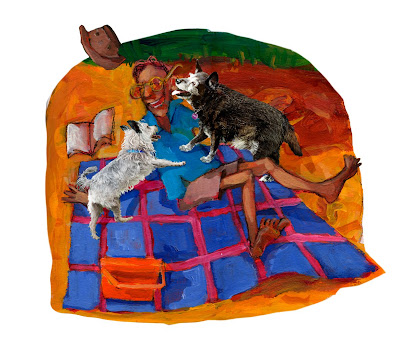
Fred and Pete deadline. It was my third and final extension, so it was nonstop painting the backgrounds, scanning them, and then collaging on the much-composited photos of the dogs in photoshop. I've been scrambling to improve my photoshop skills by joining the most excellent
Lynda.com and working through their instructional videos. Now, I am very good at learning from books and have taken college courses to try to learn computer skills , but it is now my considered opinion that learning computer software from videos is far and away the best method. Lynda.com has extremely high quality teaching videos with wonderful teachers.
This is the first time I've done my own scanning and conversion to cmyk for a whole book, but it turned out to be the best way because of the fact that I was scanning backgrounds to combine with the photos. I usually found I had to go back and rework the backgrounds after pasting in the dog photos and then rescan them. So I wouldn't have been able to do that if I'd had to send the art out to a professional scanning company every time. Plus I have a very good scanner - Epson Perfection 1240U, thanks to the kindness of designer/illustrator Elisa Gutierrez who gave it to me when she upgraded. At first I was dismayed when I converted from RGB to CMYK, which is print mode. I looked but couldn't find a video on Lynda.com, although I'm sure it's there - I just don't know under what subject heading - on the best method to to convert images in RGB mode to CMYK so I wouldn't lose all that beautiful colour and detail. Since colour actually makes me salivate, I was desperate to find a way for the best possible conversion. I found the following on a photoshop forum site called
MOGO forums. The author of the post goes only by the name of Shaggy. It is extremely good information, so thank you, Shaggy. The last paragraph gives the actual what-to-click steps. So here it is:
"Rendering intents.
Rendering intents do exactly what you guys are talking about, except without any of this masking talk :D Check your PS color settings (make sure the Advanced box is ticked). 3/4 of the way down you'll see the conversion options. There are 4 rendering intents which tell the CMS, in this case Photoshop, how to handle out of gamut colors when converting to CMYK.
The four intents are:
• relative colorimetric
• absolute colorimetric
• perceptual
• saturation
So what is the difference? Remember that the rendering intent's main job is to handle situations where colors are out of gamut. Imagine a circle. Inside the circle are all the colors in your image that are printable. Outside the circle are your 'out of gamut' colors.
Relative colorimetric - takes your out of gamut colors and moves them the the edge of the circle. The colors that were already in gamut will stay where they are (technically they may move a little, but the shift wouldn't be detectable to your eye).
Absolute colorimetric - related to relative except it moves the white point to the white point of the cmyk space, which is the whiteness of the paper. Because of this paper simulation, absolute colorimetric is used for proofing images (simulating how an image will look on a different printer and paper).
Perceptual - Looks at the out of gamut colors and moves ALL of your colors (both in gamut and out) so that the relationships between the colors stay the same. This is a common rendering intent for photographs.
Saturation - takes all of those out of gamut colors and pushes them the the portion of the gamut that will give the brightest, most saturated colors. They may not be accurate, but they will be the most saturated that the destination printer can print.
So although a mask of the out of gamut colors would get a printable result, rendering intents exist to do this work for you with mathematical precision.
So how do you use them? By default, Photoshop uses the rendering intent selected in your color settings when you use Image > Mode > CMYK. A more flexible solution is to select Edit > Mode > Convert to Profile. Select the 'flavor' of CMYK that you'd like to convert to. Tick the preview checkbox and then rotate through the rendering intents to see what gives you the most pleasing result. Most likely, relative colorimetric or perceptual will give you the best looking image."
I have photoshop CS4, so the steps were a little different:
>Edit>Convert to Profile> then go down to the bottom of the drop down menu under Conversion Options and click on the up/down arrows to the right of Intent. If you have your preview box checked (top right), look at your photoshop image as you rotate through the different Intents to choose the one you like.
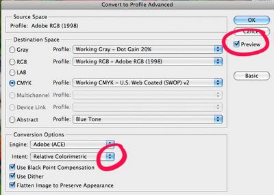
Remember you can tinker with contrast and brightness etc after the conversion, although it will probably be at the maximum saturation for most of the colours. For Fred and Pete, I ended up using relative or absolute colorimetric for nearly all of them. Of course, your perception is contingent on the accuracy of your computer screen. I'll report back when I see printer's proofs on how closely they resemble the cmyk files I sent. As a ps. I would recommend copying your final file and doing the cmyk conversion on the copy, as converting to cmyk flattens your layers.


