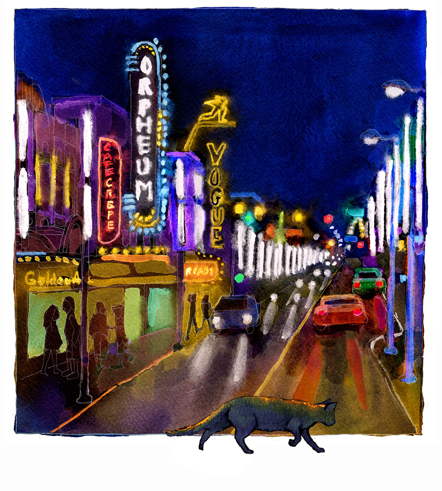
I'm in the final stretch of illustrating the 3rd Mr Got to Go book. After back-and-forthing with editor, Peter Carver; publisher, Richard Dionne; and author, Lois Simmie, we agreed on what the image should be. Publishers generally like a lot of control with the cover because it's the main marketing tool for the book, so it means creating a number of sketches (in this case, photo-composite "sketches"), and a lot of discussion. Yesterday, I drew the final line.
The stages to get to the final line were: creating photo composites of settings and cats; deciding which to go with; doing a rough drawing from the one Peter Carver liked the best (fortunately this was also my favourite. It was a pleasant surprised that he chose it unprompted.) Then the rough drawing is scanned into the computer so I can spend a few hours monkeying around in photoshop with the relative size of the cat to background, moving things around to leave room for the designer's text, and cleanup. Then that gets printed out nice and dark on ordinary bond paper to be traced onto good watercolour paper on the light table. My preferred illustration paper is Bockingford 140 lb. The colour looks great on it and it's very forgiving - you can lift off colour easily and even scrub off whole sections with a natural sponge. Then comes the precise part of the job of carefully drawing the details and trying to breathe life into the figure of Mr Got to Go. Sometimes I will do the final line right in photoshop, then print it directly onto 90 lb watercolour paper using my creaky, tempermental HP Deskjet 1220 C. It can take paper up to 13.5 inches wide and sometimes likes watercolour paper if I feed the deckle edge first, cross my fingers, and pray, beg, and curse. But final line work done on the computer can be too perfect and a little stiff. It's important that this cover be as human and emotional as possible. This is the simplest Got to Go cover of the three - only one character and very little factual detail to adhere to.
Today, I'll be painting. Key tricky bits are creating liquid living eyes, manipulating the background colour to spotlight the grey cat - on ongoing illustration challenge in this series has been that the hero is small and grey - and all the reflections, shadows, and gleaming lights.