I recently went to the launch of the lovely
Dream Boats by Kirsti Wakelin and Dan Bar-el. Kirsti's tour de force illustration was at once a display of fabulous traditional art skills and techie brilliance. After the presentation, I cornered her so I could point at different mystifying sections of her illustrations and ask "how the heck did you do that?...and that?...and that?" When she explained how she managed to do
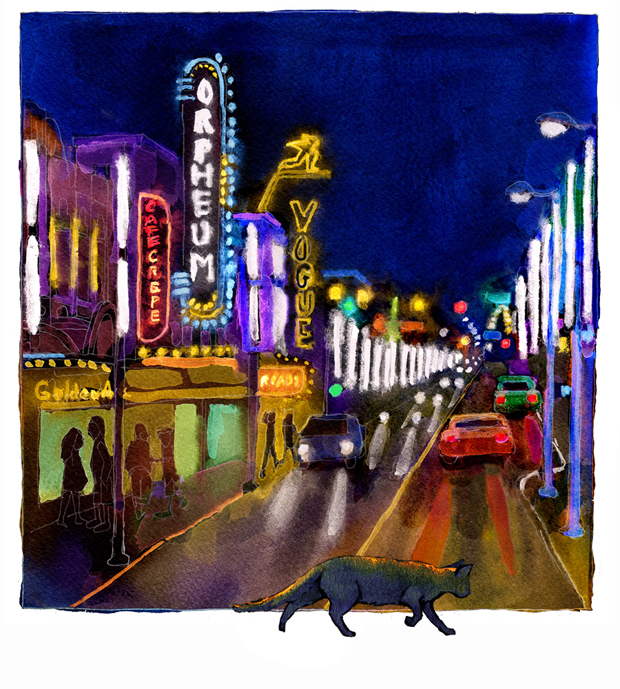
dozens of stars in an indigo sky which all gradated perfectly from pure white to midnight blue, fireworks went off in my cerebral cortex. She'd painted black ink dots on wet paper, scanned in the art, opened it in photoshop, and inverted the image to its negative (command i). I hugged myself with joy and scurried home, chuckling like a happy madwoman. I'd been painting one lousy version after another of a spot illustration of Mr. Got To Go crossing Vancouver's theatre row. I had been growing increasingly frustrated by the impossibility of doing the neon marquees in watercolour. After a few tests to figure out what would be the negative colours and tonal values of what I wanted the illustration to end up being, I painted this ugly watercolour, scanned it in, then hit command i in photoshop. After a little judicious cleanup, here's the result.
Are you not amazed, impressed? Is not that cool?
Thank you clever, clever Kirsti Wakelin!

I think this trick is brilliant! Thanks for the demo.
ReplyDelete